Visualising geomagnetic data: time series, Bartels plots and contour plots
%matplotlib inline
# Import notebook dependencies

import os
import sys
import datetime as dt
import numpy as np
import pandas as pd
import matplotlib.pyplot as plt
from mpl_toolkits.mplot3d import Axes3D
from matplotlib import cm

sys.path.append('..')
from src import mag_lib as mag

# Set the data paths
ESK_2003_PATH = os.path.abspath('../data/external/ESK_2003/')
ESK_HOURLY_PATH = os.path.abspath('../data/external/ESK_hourly/')
K_INDS_PATH = os.path.abspath('../data/external/k_inds/')
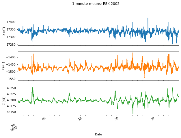
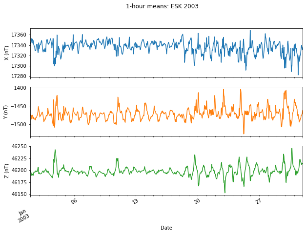
Plotting 1-minute and 1-hour observatory means
Load the 2003 1-minute data for ESK and resample to hourly means
obs = "ESK"
# 1-minute data
obs_min = mag.load_year(observatory='esk', year=2003, path=ESK_2003_PATH)
# 1-hour data
obs_hourly = obs_min.resample('1h').mean()
Print the first few lines of each data set
obs_min.head()
| DOY | ESKX | ESKY | ESKZ | ESKF | |
|---|---|---|---|---|---|
| DATE_TIME | |||||
| 2003-01-01 00:00:00 | 1 | 17342.0 | -1473.2 | 46197.8 | 49367.5 |
| 2003-01-01 00:01:00 | 1 | 17341.5 | -1473.4 | 46197.8 | 49367.3 |
| 2003-01-01 00:02:00 | 1 | 17342.0 | -1473.4 | 46197.8 | 49367.5 |
| 2003-01-01 00:03:00 | 1 | 17342.2 | -1473.8 | 46197.6 | 49367.4 |
| 2003-01-01 00:04:00 | 1 | 17342.6 | -1473.7 | 46197.6 | 49367.5 |
obs_hourly.head()
| DOY | ESKX | ESKY | ESKZ | ESKF | |
|---|---|---|---|---|---|
| DATE_TIME | |||||
| 2003-01-01 00:00:00 | 1 | 17342.540000 | -1473.673333 | 46197.330000 | 49367.256667 |
| 2003-01-01 01:00:00 | 1 | 17344.796667 | -1475.575000 | 46196.248333 | 49367.088333 |
| 2003-01-01 02:00:00 | 1 | 17344.376667 | -1475.555000 | 46195.156667 | 49365.921667 |
| 2003-01-01 03:00:00 | 1 | 17348.140000 | -1485.205000 | 46191.946667 | 49364.528333 |
| 2003-01-01 04:00:00 | 1 | 17352.800000 | -1475.673333 | 46188.900000 | 49363.026667 |
>> USER INPUT HERE: Choose start and end times of the time series plots in the format ‘2003-mm-dd hh’
start_date = '2003-01-01 00'
end_date = '2003-01-31 23'
Plot the 1-minute data for the selected period
ax = obs_min.loc[start_date:end_date, 'ESKX':'ESKZ'].plot(subplots=True, figsize=(10,7),
                                                          title='1-minute means: ESK 2003', legend=False)
plt.xlabel('Date')
ax[0].set_ylabel('X (nT)')
ax[1].set_ylabel('Y (nT)')
ax[2].set_ylabel('Z (nT)')
Text(0, 0.5, 'Z (nT)')
Plot the hourly mean data for the same period
ax = obs_hourly.loc[start_date:end_date, 'ESKX':'ESKZ'].plot(subplots=True, figsize=(10,7),
                                                             title='1-hour means: ESK 2003', legend=False)
plt.xlabel('Date')
ax[0].set_ylabel('X (nT)')
ax[1].set_ylabel('Y (nT)')
ax[2].set_ylabel('Z (nT)')
Text(0, 0.5, 'Z (nT)')
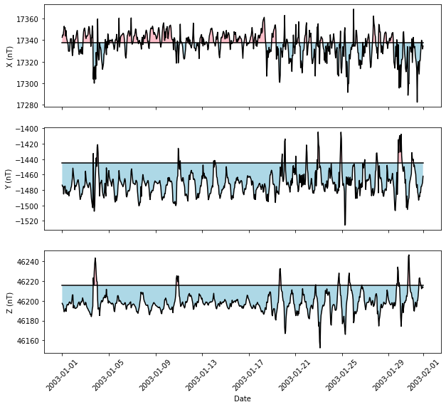
Compare hourly means with the annual means
# Resample to annual means
obs_annual = obs_min.resample('1Y').mean()
dates = obs_hourly.loc[start_date:end_date].reset_index()['DATE_TIME']
annual = pd.DataFrame(index=dates, data=[[obs_annual.loc['2003-12-31','ESKX'], obs_annual.loc['2003-12-31','ESKY'],
                                       obs_annual.loc['2003-12-31','ESKZ']]], columns=['ESKX', 'ESKY', 'ESKZ'])
fig, (ax1, ax2, ax3) = plt.subplots(nrows=3, sharex=True, figsize=(10,9))
# X component
ax1.plot(dates, obs_hourly.loc[start_date:end_date,'ESKX'], 'k')
ax1.plot(annual['ESKX'], 'k')
ax1.fill_between(dates, obs_hourly.loc[start_date:end_date,'ESKX'], annual['ESKX'].values,
                 where=obs_hourly.loc[start_date:end_date,'ESKX'] < annual['ESKX'], facecolor='lightblue',
                 interpolate=True)
ax1.fill_between(dates, obs_hourly.loc[start_date:end_date,'ESKX'], annual['ESKX'],
                 where=obs_hourly.loc[start_date:end_date,'ESKX'] >= annual['ESKX'], facecolor='pink',
                 interpolate=True)
ax1.set_ylabel('X (nT)')
# Y component
ax2.plot(dates, obs_hourly.loc[start_date:end_date,'ESKY'], 'k')
ax2.plot(annual['ESKY'], 'k')
ax2.fill_between(dates, obs_hourly.loc[start_date:end_date,'ESKY'], annual['ESKY'].values,
                where=obs_hourly.loc[start_date:end_date,'ESKY'] < annual['ESKY'], facecolor='lightblue',
                 interpolate=True)
ax2.fill_between(dates, obs_hourly.loc[start_date:end_date,'ESKY'], annual['ESKY'],
                 where=obs_hourly.loc[start_date:end_date,'ESKY'] >= annual['ESKY'], facecolor='pink',
                 interpolate=True)
ax2.set_ylabel('Y (nT)')
# Z component
ax3.plot(dates, obs_hourly.loc[start_date:end_date,'ESKZ'], 'k')
ax3.plot(annual['ESKZ'], 'k')
ax3.fill_between(dates, obs_hourly.loc[start_date:end_date,'ESKZ'], annual['ESKZ'].values,
                where=obs_hourly.loc[start_date:end_date,'ESKZ'] < annual['ESKZ'], facecolor='lightblue',
                 interpolate=True)
ax3.fill_between(dates, obs_hourly.loc[start_date:end_date,'ESKZ'], annual['ESKZ'],
                where=obs_hourly.loc[start_date:end_date,'ESKZ'] >= annual['ESKZ'], facecolor='pink',
                 interpolate=True)
ax3.set_ylabel('Z (nT)')
plt.xticks(rotation = 45)
plt.xlabel('Date', )
Text(0.5, 0, 'Date')
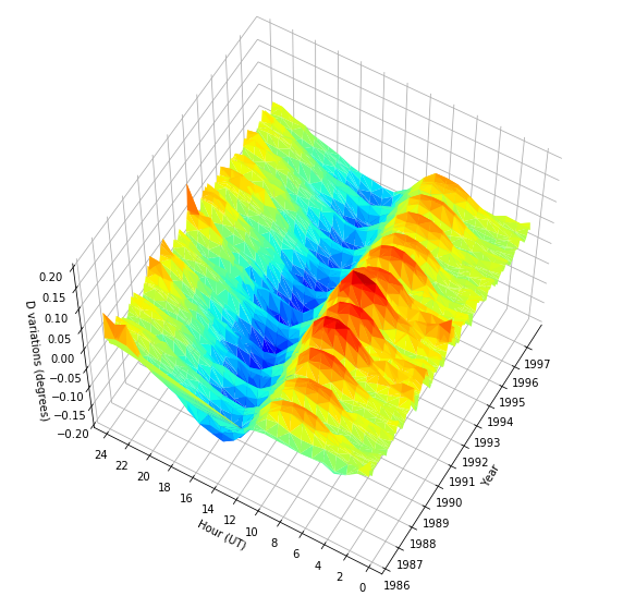
Daily, seasonal and solar variations in declination
Here we plot the daily variation in declination at Eskdalemuir (with the secular variation removed) over a selectable number of years (files from 1911 to 2017 are available in this repository). The seasonal variation in the amplitude of the daily variation is well illustrated by the plot and, if you extend the plot over a complete solar cycle, it is clear that there is a solar cycle modulation as well. Try 1986-1997 as an example (see also https://en.wikipedia.org/wiki/List_of_solar_cycles for a list of suitable date ranges.)
>> USER INPUT HERE: Choose the start and end years of the contour plot.
Files from 1911 to 2017 are avaliable in this repository. We recommend plotting at least one 11 year solar cycle ( e.g. 1986 to 1997) in order to see all the variations. The plotting may be a little slow if you plot the entire data set - be patient!
start_year = 1986
end_year = 1997
# Read declination data from IAGA-2002 format files, or calculate it from the given components if necessary
hourly = mag.read_obs_hmv_declination(obscode='esk', year_st=start_year, year_fn=end_year, folder=ESK_HOURLY_PATH)
hourly.reset_index(inplace=True)
# Calculate the time as minutes since midnight and date as Julian date
# This is needed for plotting purposes as the axes must be numbers, not datetime objects or strings
hourly['mins_count'] = hourly['DATE_TIME'].map(lambda x: x.time().hour*60 + x.time().minute)
hourly['julian_date'] = hourly['DATE_TIME'].map(lambda x: int(x.to_julian_date()))

# Calculate the monthly mean for each hourly interval of the day
monthly = hourly.groupby([hourly['DATE_TIME'].dt.year, hourly['DATE_TIME'].dt.month, hourly['DATE_TIME'].dt.hour]).mean()

# Calculate the monthly mean over all hourly intervals
monthly_all = hourly.groupby([hourly['DATE_TIME'].dt.year, hourly['DATE_TIME'].dt.month]).mean()

# Calculate the daily declination variations as the monthly average of the hourly intervals minus the total monthly mean
variations = monthly['D'].values - monthly_all['D'].values.repeat(24)

# New variables for the dates and times
times = monthly.mins_count.values
days = monthly.julian_date.values
# Convert the Julian dates back to datetimes and strings for axis labels
epoch = pd.to_datetime(0, unit='s').to_julian_date()
dates = pd.to_datetime(days[0:-1:24]-epoch, unit='D').strftime('%Y')
Plot declination variations using trisurf. If you used ‘%matplotlib notebook’ above, the plot will be interactive - you can pan and zoom for different perspectives of the 3D surface.
The spacing of the tick labels on the date axis can be controlled by changing n below, e.g. n=5 gives one tick per 5 years.
fig = plt.figure(figsize=(10,10))
ax = fig.add_subplot(1, 1, 1, projection='3d')
ax.plot_trisurf(days, times, variations, cmap=cm.jet, vmin=-0.15, vmax=0.15, antialiased=True)

# Set x tick labels to 1 per n year
n=1
ax.set_xticks(days[0::24*12*n])
ax.set_xticklabels(dates[0::12*n],rotation=0)
ax.set_xlabel('Year', rotation=60, labelpad=8)
ax.set_xlim([days[0], days[-1]])

# Set y labels to hours
ax.set_yticks(np.arange(0, 1560, 120))
ax.set_yticklabels(np.arange(0, 26, 2))
ax.set_ylabel('Hour (UT)')

# z axis setup
ax.set_zlabel('D variations (degrees)', labelpad=8)
ax.set_zlim([-0.2, 0.2])
ax.tick_params(axis='z', pad=5)

# Set initial viewpoint elevation and azimuth
ax.view_init(elev=60, azim=210)

# Set the background colour to white
ax.w_xaxis.set_pane_color((1.0, 1.0, 1.0, 1.0))
ax.w_yaxis.set_pane_color((1.0, 1.0, 1.0, 1.0))
ax.w_zaxis.set_pane_color((1.0, 1.0, 1.0, 1.0))
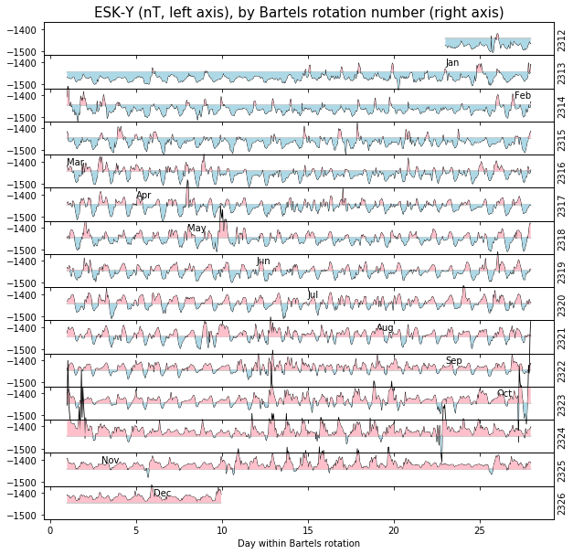
Plotting observatory data by the Bartels rotation number
Solar rotations are numbered by the Bartels solar rotation number, with Day 1 of rotation 1 chosen as 8th February 1832. In this section, hourly mean values for 2003 at Eskdalemuir Observatory are plotted ordered by Bartels rotation number (the X, Y and Z geomagnetic components may be selected below.) The plot shows a number of the features of geomagnetic field behaviour:
The annual mean is plotted as a horizontal line in each row dividing the plots into sections ‘above’ and ‘below’ the mean. The proportions of the plots above and below changes as the year progresses because of the slow core field changes with time the secular variation.
The daily variation in each element is clear. Note the differences between winter and summer, which we also saw in the 3D contour plot above.
Although substantially attenuated by taking hourly means, times of magnetic disturbances are obvious.
The rows are plotted 27 days long because the equatorial rotation period, as seen from Earth, is approximately 27 days. As a result, if a region on the Sun responsible for a disturbance on one day survives a full rotation, it may cause a further disturbance 27 days later and this will line up vertically in the plots.
This plot reproduces an example found in the Eskdalemuir monthly bulletin of December 2003, which can be found at http://geomag.bgs.ac.uk/data_service/data/bulletins/esk/2003/esk_dec03.pdf (pages 22-24).
#These functions are used to produce the Bartels plots
def bartels_rotation(datetime, return_indexes=True):
    """

    Args:
        date (datetime/DatetimeIndex)

    Returns:
        tuple (rotation number, day within rotation, hour within day)

    """
    if type(datetime) is pd.DatetimeIndex:
        date, hour = datetime.date, datetime.hour
    elif type(datetime) is dt.datetime:
        date, hour = datetime.date(), datetime.hour
    # Number of days since Bartels 0
    ndays = pd.to_timedelta(date - dt.date(1832, 2, 8)).days
    bartels_rotation = ndays//27 + 1
    day = ndays%27 + 1
    if return_indexes:
        return bartels_rotation, day, hour
    else:
        return tuple([item.values for item in (bartels_rotation, day, hour)])


def create_bartels_index(df, nlevels=3):
    """Replaces a DatetimeIndex with a Bartels MultiIndex

    If nlevels is 3, the MultiIndex has levels:
        0: (bartrot) Bartel rotation number
        1: (bartrotday) Day within the current Bartel rotation
        2: (hourofday) Hour within the current day
    else if nlevels is 2:
        0: (bartrot) Bartel rotation number
        1: (bartrotday) Fractional day

    Args:
        df (DataFrame)

    Returns:
        DataFrame

    """
    bartrot, bartrotday, hourofday = bartels_rotation(df.index)
    if nlevels == 3:
        df.index = pd.MultiIndex.from_arrays(
            (bartrot, bartrotday, hourofday), names=("bartrot", "bartrotday", "hourofday")
        )
    elif nlevels == 2:
        df.index = pd.MultiIndex.from_arrays(
            (bartrot, bartrotday + hourofday/24), names=("bartrot", "bartrotday")
        )
    else:
        raise NotImplementedError()
    return df
Calculate annual means and append them to the hourly dataframe
obs = 'ESK'
annual_means = (
    obs_min[[f"{obs}{i}" for i in "XYZF"]].resample("1Y").mean()
    .rename(columns={f"{obs}{i}":f"{obs}{i}_mean" for i in "XYZF"})
    .reindex(index=obs_hourly.index, method="nearest")
)
obs_hourly = obs_hourly.join(annual_means)
obs_hourly.head()
| DOY | ESKX | ESKY | ESKZ | ESKF | ESKX_mean | ESKY_mean | ESKZ_mean | ESKF_mean | |
|---|---|---|---|---|---|---|---|---|---|
| DATE_TIME | |||||||||
| 2003-01-01 00:00:00 | 1 | 17342.540000 | -1473.673333 | 46197.330000 | 49367.256667 | 17337.347456 | -1444.378883 | 46215.321921 | 49381.42141 |
| 2003-01-01 01:00:00 | 1 | 17344.796667 | -1475.575000 | 46196.248333 | 49367.088333 | 17337.347456 | -1444.378883 | 46215.321921 | 49381.42141 |
| 2003-01-01 02:00:00 | 1 | 17344.376667 | -1475.555000 | 46195.156667 | 49365.921667 | 17337.347456 | -1444.378883 | 46215.321921 | 49381.42141 |
| 2003-01-01 03:00:00 | 1 | 17348.140000 | -1485.205000 | 46191.946667 | 49364.528333 | 17337.347456 | -1444.378883 | 46215.321921 | 49381.42141 |
| 2003-01-01 04:00:00 | 1 | 17352.800000 | -1475.673333 | 46188.900000 | 49363.026667 | 17337.347456 | -1444.378883 | 46215.321921 | 49381.42141 |
Change the dataframe index to a Bartels-rotation-based MultiIndex and preserve the time index as a column instead
obs_hourly["time"] = obs_hourly.index
obs_hourly = create_bartels_index(obs_hourly, nlevels=2)
Identify the calendar month starts
month_starts = obs_hourly["time"].where(
    (obs_hourly["time"].dt.day == 1) & (obs_hourly["time"].dt.hour == 0)
).dropna()
month_starts
bartrot  bartrotday
2312     23.0         2003-01-01
2313     27.0         2003-02-01
2315     1.0          2003-03-01
2316     5.0          2003-04-01
2317     8.0          2003-05-01
2318     12.0         2003-06-01
2319     15.0         2003-07-01
2320     19.0         2003-08-01
2321     23.0         2003-09-01
2322     26.0         2003-10-01
2324     3.0          2003-11-01
2325     6.0          2003-12-01
Name: time, dtype: datetime64[ns]
>> USER INPUT HERE: Choose the component to plot
var options:
X
Y
Z
var = "Y"
Loop through each bartrot and plot it on its own axis
bartrots = range(obs_hourly.index[0][0], obs_hourly.index[-1][0] + 1)

fig, axes = plt.subplots(
    nrows=len(bartrots), ncols=1, figsize=(10, 10),
    gridspec_kw = {'hspace':0},
    sharex=True, sharey=True
)
for bartrot, ax in zip(bartrots, axes):
    x = obs_hourly.loc[bartrot].index
    y0 = obs_hourly.loc[bartrot][f"{obs}{var}_mean"]
    y1 = obs_hourly.loc[bartrot][f"{obs}{var}"]
    ax.plot(x, y0, color="black", linewidth=0.4)
    ax.plot(x, y1, color="black", linewidth=0.8, clip_on=False)
    ax.fill_between(
        x, y0, y1, where=y1 < y0,
        facecolor='lightblue', interpolate=True, zorder=9#, clip_on=False currently causes a bug
    )
    ax.fill_between(
        x, y0, y1, where=y1 >= y0,
        facecolor='pink', interpolate=True, zorder=10#, clip_on=False
    )
    ax_r = ax.twinx()
    ax_r.set_ylabel(bartrot, fontsize=10)
    ax_r.set_yticks([])
    # some magic which enables lines from one axis to show on top of other axes
    ax.patch.set_visible(False)

    # Add text identifying the start of each month
    if bartrot in month_starts.keys():
        bartrotday = float(month_starts.loc[bartrot].index.values)
        month = month_starts.loc[bartrot].dt.strftime("%b").values[0]
        ax.text(bartrotday, y0.iloc[0] - 85, month, verticalalignment="top")

ax.set_ylim((y0.iloc[0] - 75, y0.iloc[0] + 75))
ax.set_xlabel("Day within Bartels rotation");
axes[0].set_title(f"{obs}-{var} (nT, left axis), by Bartels rotation number (right axis)",
                  fontsize=15);
Geomagnetic jerks
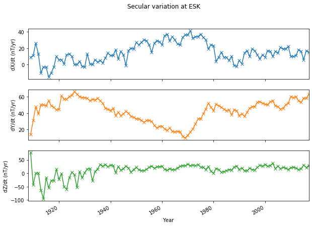
Geomagnetic jerks are rapid changes in the trend of secular variation (SV), traditionally thought of as a ‘V’ (or inverted ‘V’) shape punctuating several years or decades of roughly linear SV. They are of internal origin, possibly linked to hydromagnetic wave motions in Earth’s fluid outer core, and occur at irregular intervals on average about once per decade. Their magnitudes vary according to location, with some events observed globally (e.g. 1969) and others confined to regional scales (e.g. 2003). In this section, we plot SV calculated as first differences of observatory annual means to see various geomagnetic jerks.
The code below plots the \(X\), \(Y\) and \(Z\) components of SV for a user-specified observatory; we have provided a file containing the observatory annual means held by BGS, with baseline corrections already applied. These are the data available at http://www.geomag.bgs.ac.uk/data_service/data/annual_means.shtml - that webpage contains a list of observatories for which BGS holds annual mean values, which you may find helpful when selecting an observatory below. To get started, try looking at the \(Y\) component of a European observatory around 1969 (e.g. Eskdalemuir [ESK], Niemegk [NGK] or Chambon-la-Foret [CLF]).
>> USER INPUT HERE: Choose the magnetic observatory (three digit IAGA code)
obs_name = 'ESK'
Read in the observatory annual means
obs_annual = mag.read_obs_ann_mean(obscode=obs_name, filename='../data/external/oamjumpsapplied.dat')
obs_annual.head()
| Code | Colat | Long | alt(m) | year | D | I | H | X | Y | Z | F | |
|---|---|---|---|---|---|---|---|---|---|---|---|---|
| 1 | ESK | 34.683 | 356.800 | 245 | 1908.5 | -18.555 | 69.618 | 16825 | 15951 | -5353 | 45285 | 48310 |
| 2 | ESK | 34.683 | 356.800 | 245 | 1909.5 | -18.502 | 69.645 | 16830 | 15960 | -5339 | 45362 | 48384 |
| 3 | ESK | 34.683 | 356.800 | 245 | 1910.5 | -18.388 | 69.627 | 16830 | 15971 | -5308 | 45319 | 48344 |
| 4 | ESK | 34.683 | 356.800 | 245 | 1911.5 | -18.207 | 69.615 | 16840 | 15997 | -5260 | 45319 | 48347 |
| 5 | ESK | 34.683 | 356.800 | 245 | 1912.5 | -18.065 | 69.617 | 16840 | 16010 | -5221 | 45320 | 48348 |
Calculate the SV
obs_sv = obs_annual[['X', 'Y', 'Z']].astype('float').diff()
obs_sv.insert(0, 'year', obs_annual['year'].astype('float') - 0.5)
obs_sv.head()
| year | X | Y | Z | |
|---|---|---|---|---|
| 1 | 1908.0 | NaN | NaN | NaN |
| 2 | 1909.0 | 9.0 | 14.0 | 77.0 |
| 3 | 1910.0 | 11.0 | 31.0 | -43.0 |
| 4 | 1911.0 | 26.0 | 48.0 | 0.0 |
| 5 | 1912.0 | 13.0 | 39.0 | 1.0 |
Plot all three components of SV
ax = obs_sv.plot(x='year', subplots=True, figsize=(10,7), title='Secular variation at %s' % obs_name,
                 legend=False, marker='x')
plt.xlabel('Year')
ax[0].set_ylabel('dX/dt (nT/yr)')
ax[1].set_ylabel('dY/dt (nT/yr)')
ax[2].set_ylabel('dZ/dt (nT/yr)')
Text(0, 0.5, 'dZ/dt (nT/yr)')
Exercise
Plot the secular acceleration (SA, the second time derivative of the gemagnetic field. This is the first time derivative of the SV) at your chosen observatory. What do jerks look like in the SA? Hint: This is a very similar calculation to that used above to obtain the SV from field values…
Geomagnetic pulsations
Geomagnetic pulsations are ultra-low frequency (ULF) plasma waves in Earth’s magnetosphere. They cover the range from approximately 1 mHz to 1Hz. These magnetic field line resonances are of external origin and are considered a useful tool for remotely diagnosing activity occurring in the plasmasphere, for example, density variations in plasma that can disrupt satellite communications. For interest, we have included a directory called pulsations in this repository. The directory contains 1-sec resolution data at Hartland (HAD) for two days on which pulsation activity was observed: 14-12-2018 and 11-06-2019, along with figures showing the pulsations on these days.
Challenge
Can you load in the one second magnetic data and filter them to obtain similar plots of pulsation activity?